Designed to bring authenticity and trust to the retail space, the effort was to reframe Ayurveda through a modern, clinical lens. AyurVAID’s precision-led expertise was translated into products and the identity system was expanded into a cohesive framework to ensure standards of trust, safety, and scientific credibility in contemporary retail.
CLIENT
AyurVAID
PROJECT
Packaging | Web Experience | Print Collaterals
AyurVAID pioneers a precision-led, evidence-based Ayurveda ecosystem. By integrating advanced diagnostics with whole-person healing, the brand creates a scalable framework that prioritizes clinical accuracy and measurable outcomes.
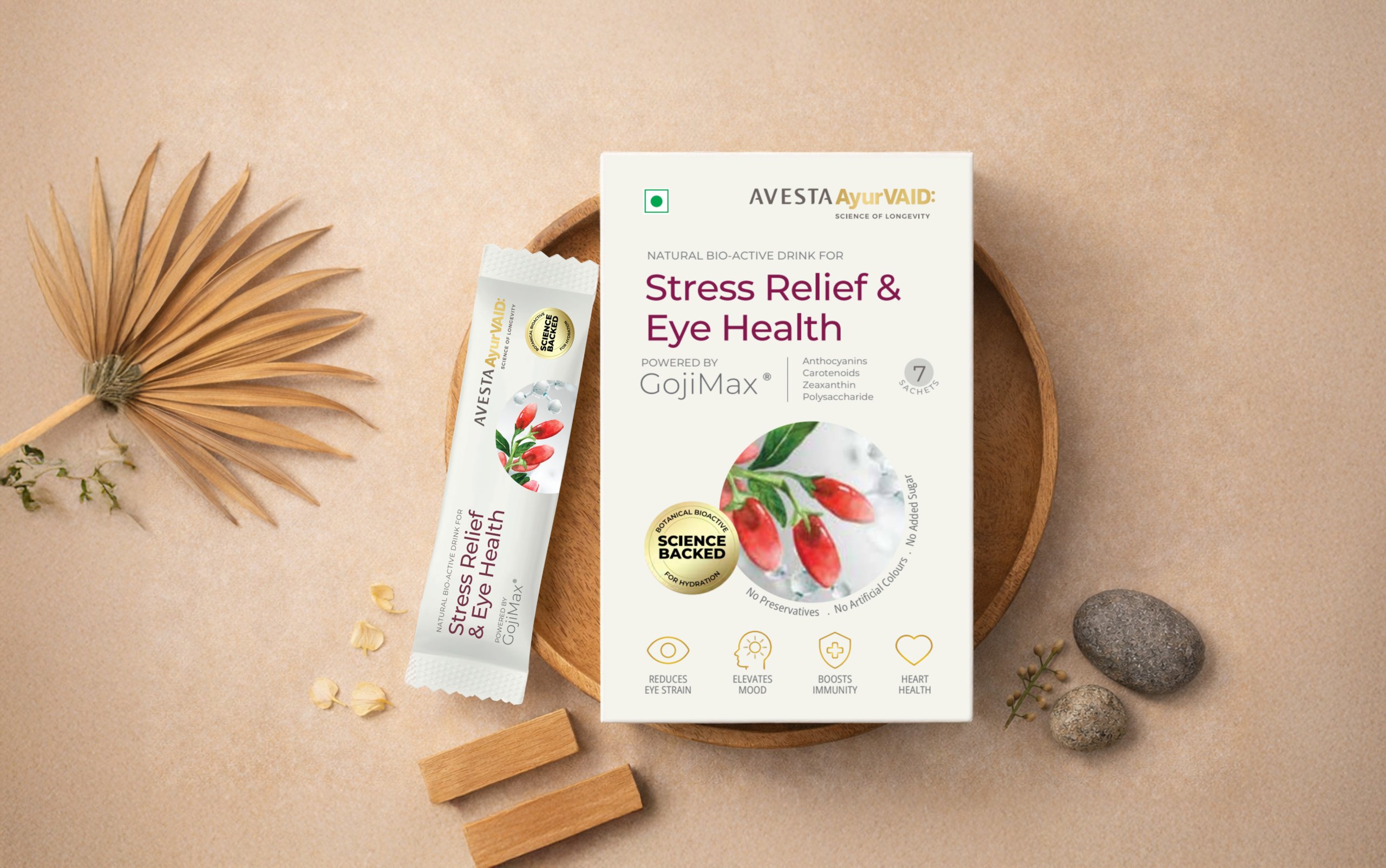
The brand reimagines traditional Ayurvedic formulations to feel clear, trustworthy, and usable in everyday life without compromising their depth or integrity. Grounded in classical principles and strengthened by modern diagnostics and medical science, Ayurveda delivers rigorous science and holistic care.
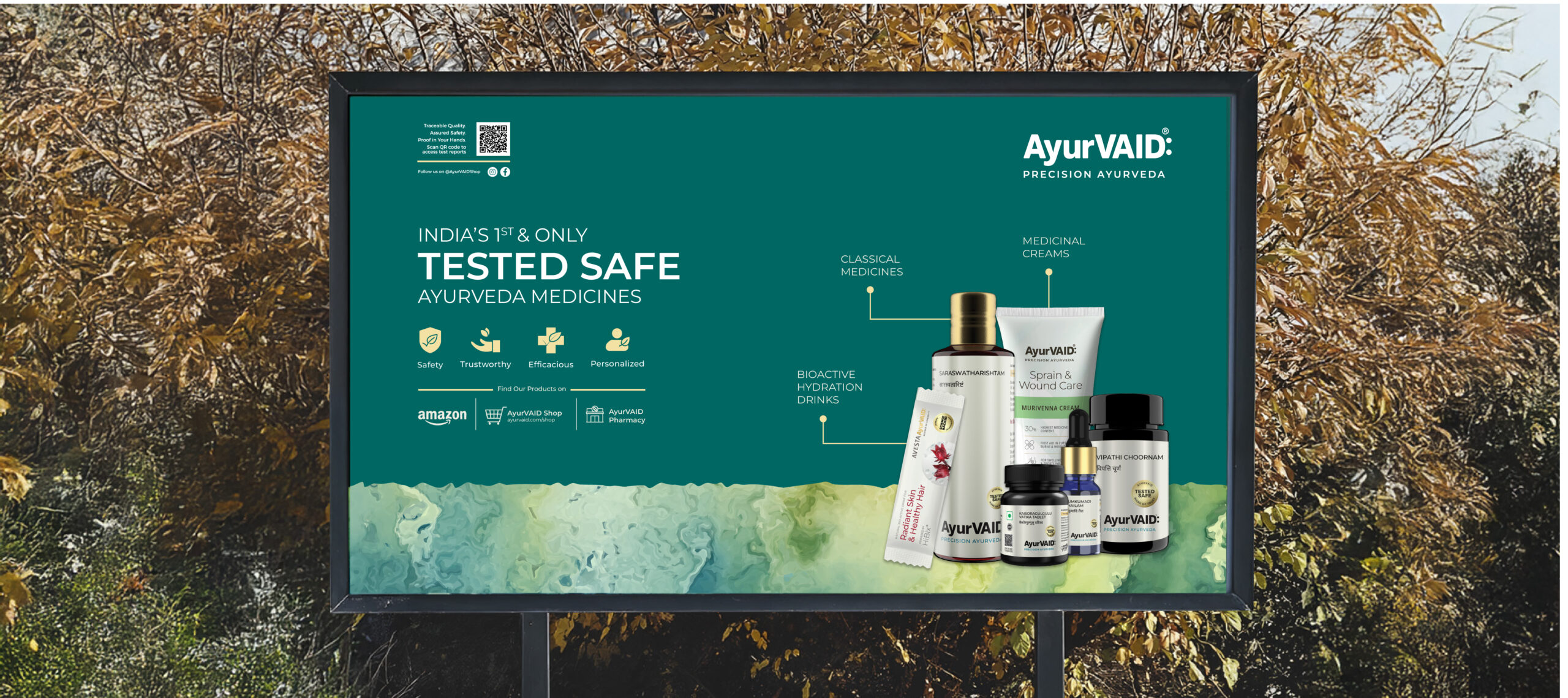
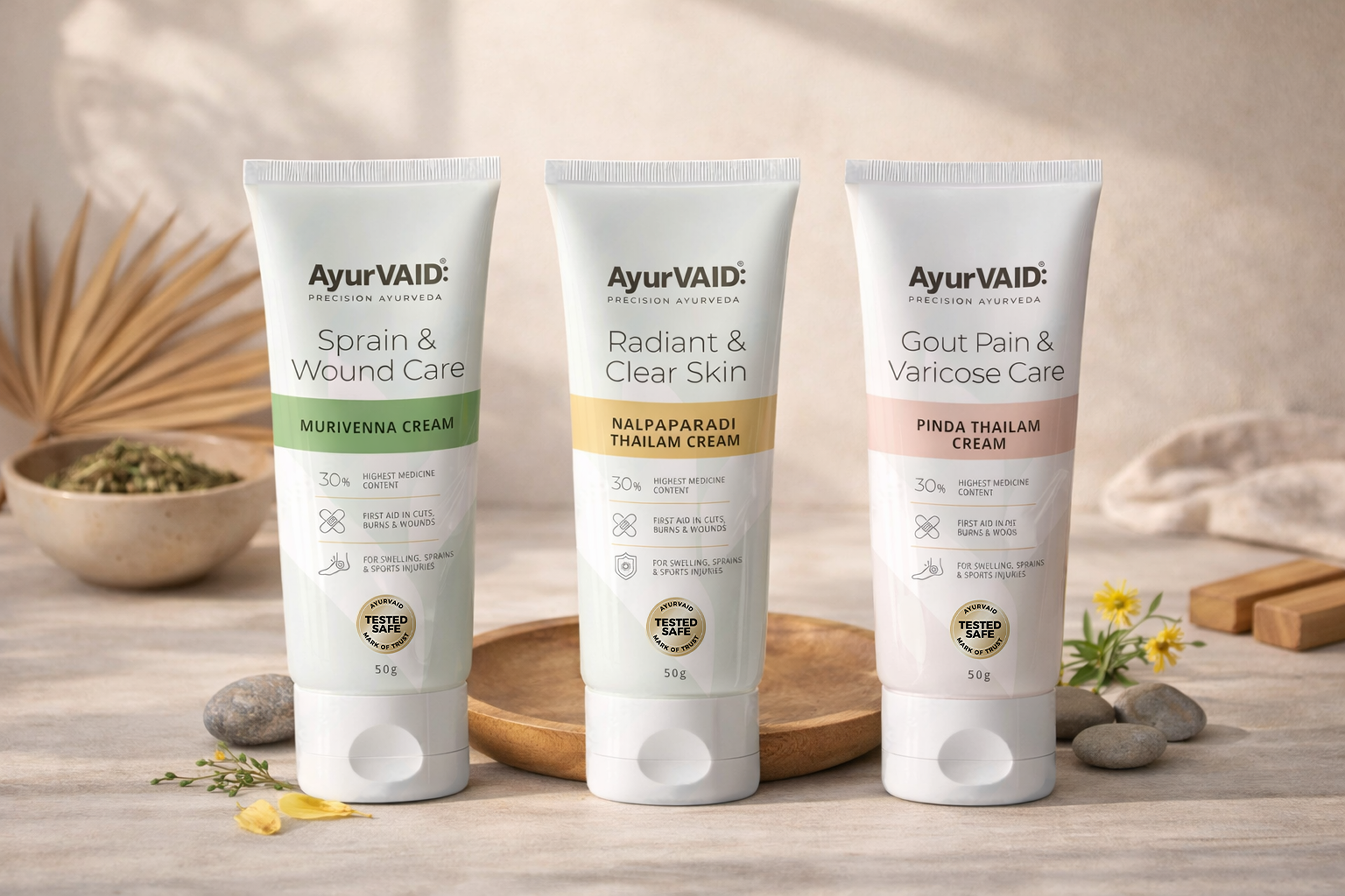
The packaging design reflects this philosophy, a structured, clear, and restrained graphic language presenting Ayurveda as studied, measurable, and thoughtfully applied. Each package communicates not just benefit, but intent: what the product does, how it works, and how it fits within the larger system of wellbeing.
The challenge was to position AyurVAID firmly within contemporary pharma while honoring the legacy of Ayurveda. A muted palette, ample white space, and clean sans serif typography establish a medical tonality. Ayurvedic nomenclature asserts authority with product names being treated with typographic discipline, often bilingual, reinforcing both lineage and legibility. Product labels communicate essential information with clarity, supported by brand signals such as “Precision Ayurveda”, “Tested Safe”, and “Science Backed”, which are necessary trust markers. Minimal colour cues and subtle botanical references distinguish the range, resulting in a credible, cohesive brand world where tradition meets science.
The product strategy highlighted clarity in formulation and trust markers, reinforcing confidence in the clinical reliability of Precision Ayurveda.
—


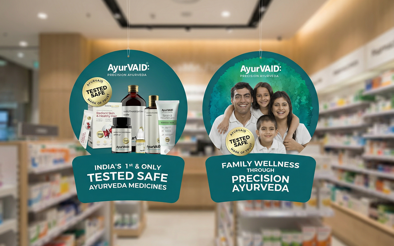
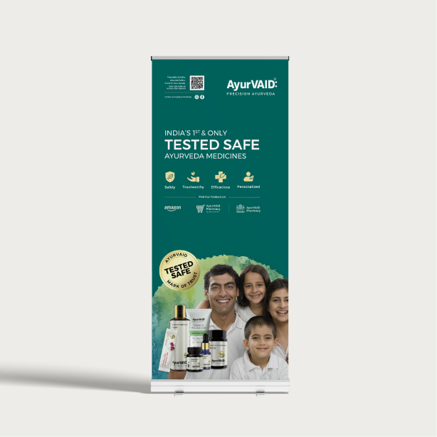
A quiet layering of watercolour textures and human imagery adds warmth, grounded by a layout that keeps exploration simple.
The AyurVAID store experience unfolds through a unified visual language, carrying seamlessly from in-store environments to digital shelves. Each surface speaks the same visual rhythm, building familiarity, trust, and quiet confidence.