Pilgrim began with a Korean skincare line, driven by a commitment to “clean beauty” offering vegan, cruelty-free formulations crafted without harmful chemicals. The brand has since expanded to include French, Spanish, and Australian beauty collections. We collaborated with them to build a visual world that establishes them as a brand that unites nature’s beauty secrets from cultures across the globe.
CLIENT
Pilgrim
PROJECT
Brand Strategy
Visual Positioning
Brand Guidelines
Packaging
Print
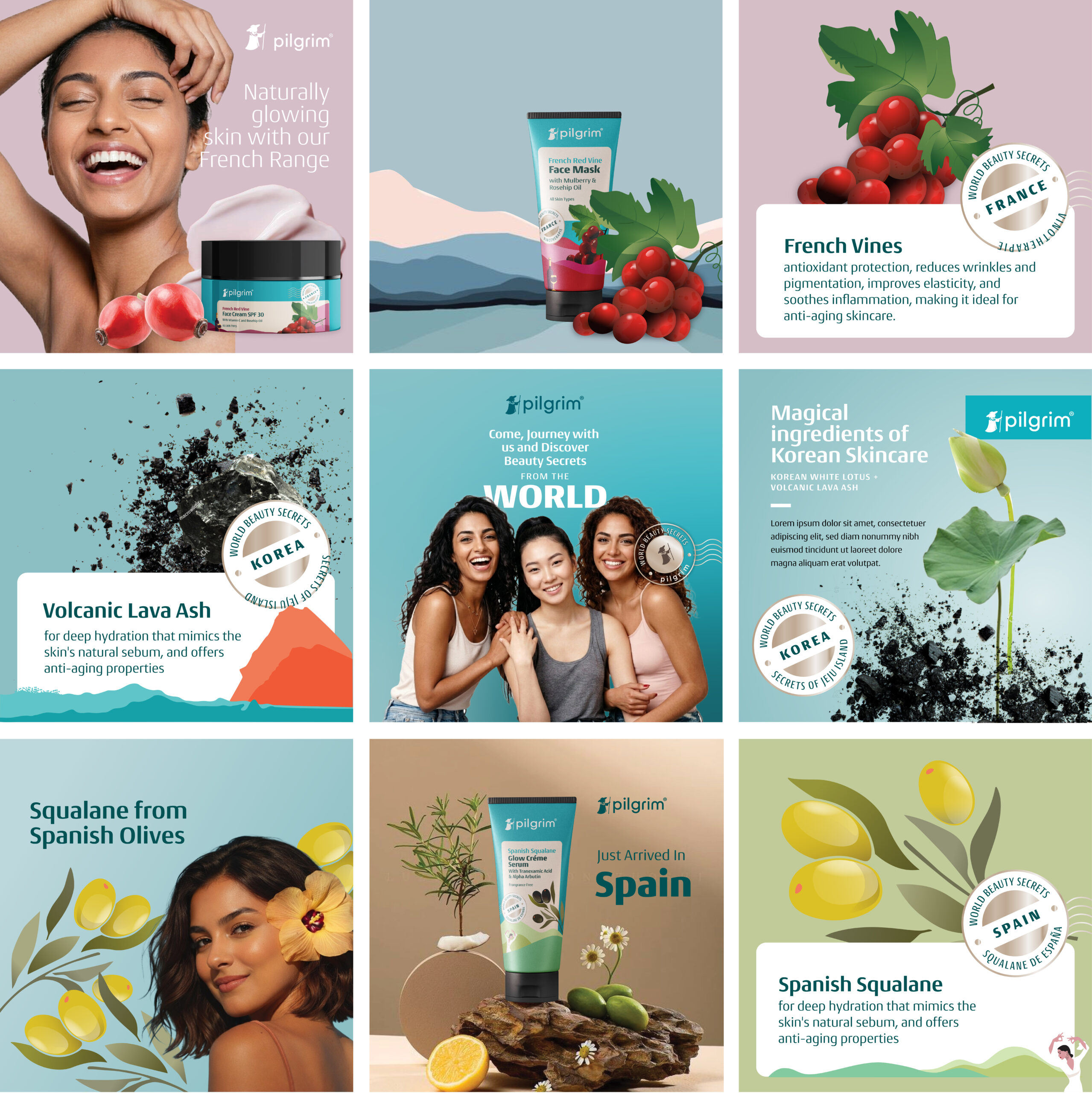
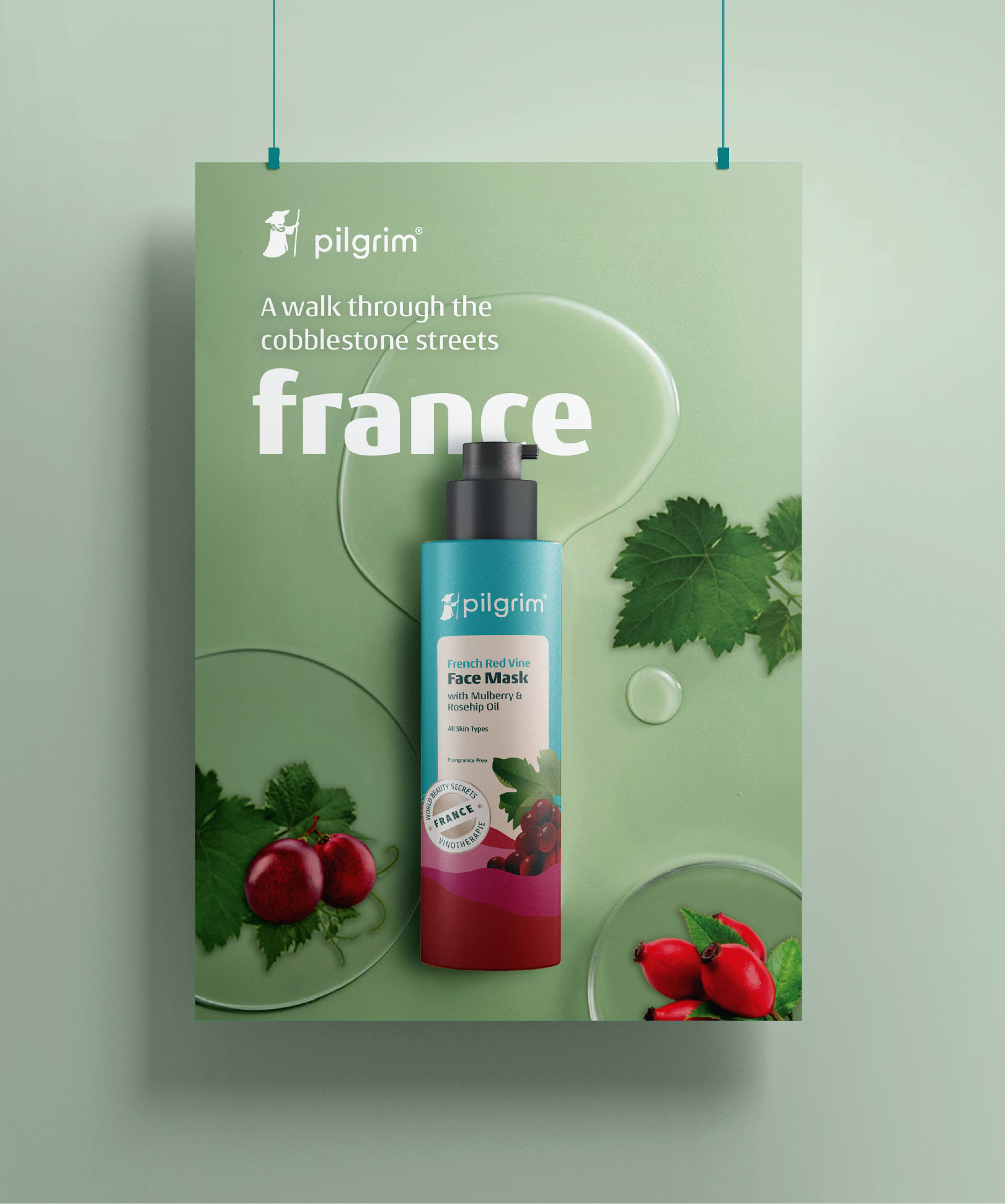
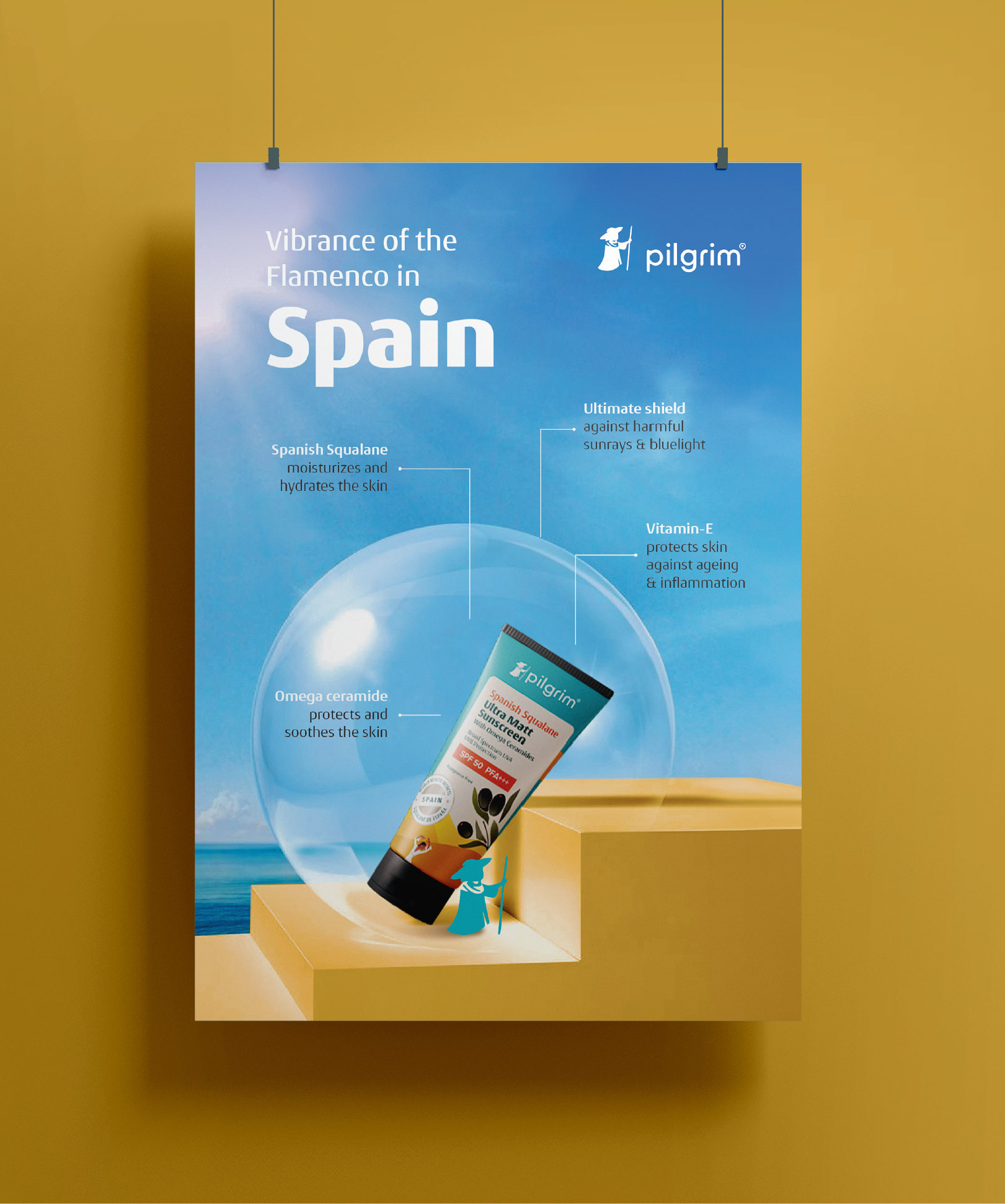
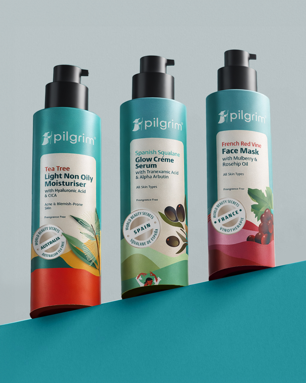
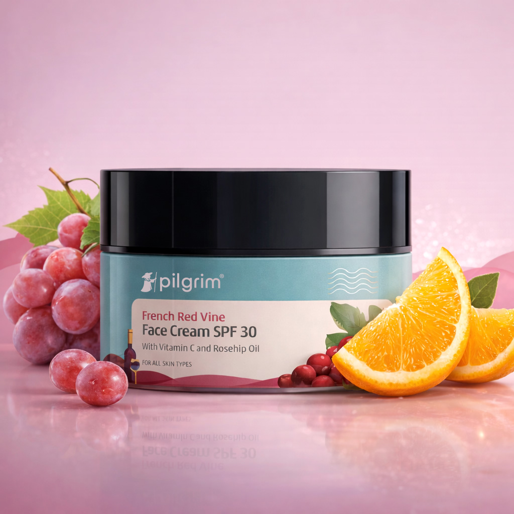
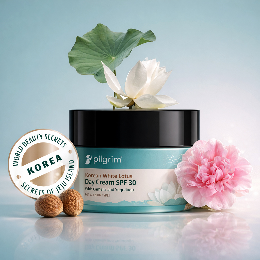
Pilgrim is one of India’s fastest growing D2C beauty brands focused on scientific innovation and nature’s hidden treasures. We were brought in to strengthen their visual positioning with a bold and expressive identity that clearly establishes Pilgrim as a global curator of beauty traditions. The first step was a deep dive into briefing documents studying competitive landscapes and global cultural cues through extensive desk research and regional mapping. This groundwork allowed us to align on the stylistic direction and messaging tone that would define the brand’s visual identity. One of the biggest challenges we faced was perception because as the brand gained popularity through its Korean skincare line consumers began to associate the signature teal only with that specific collection. To leverage this impression we decided to reclaim teal as their core brand color and connect it visually to a much larger story. The strategic aim was to establish universality by associating the teal with every region. We introduced the concept of Native Origins which is the idea that every secret from the original source belongs to the unique character of its region. We used this to build distinct identities for each ingredient and its birthplace furthering the vision to help individuals discover their most beautiful selves through nature. This became a strategic framework to establish each territory while reinforcing a cohesive overarching identity. Teal was repositioned as the primary brand color decoupled from any single collection. We built a new palette system crafted custom illustrations for every region and introduced a travel inspired seal creating a globally expansive visual world. This strategy allowed Pilgrim to confidently express its true promise of clean beauty born from rituals across cultures.
We focused on the idea that every secret from the original source belongs to the unique character of its region. We used this to build distinct identities for each ingredient.
—


A global skincare brand needed a global design system.
We created a packaging where every product tells a geographical story through a disciplined label architecture and visualised ingredients as immersive worlds.


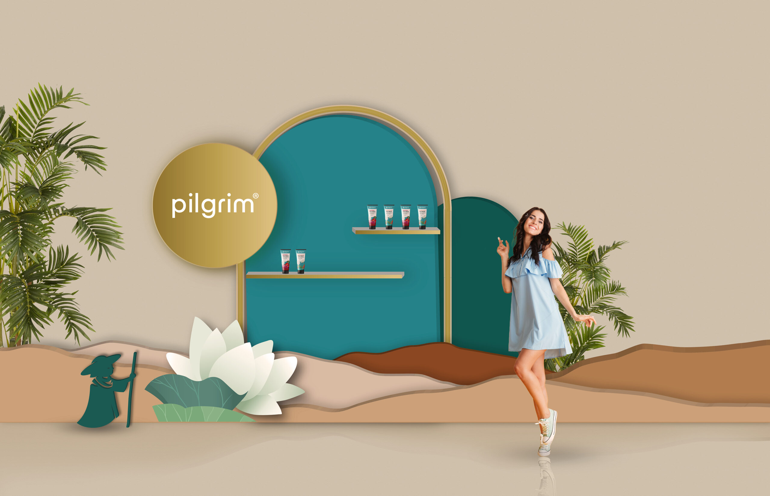
We developed comprehensive brand guidelines to integrate this unique packaging system, extending it across print and digital touchpoints.